

P.S. Jess is still hosting a series of guest posts on color inspiration. I highly encourage you to check out the rest of the color tutorials (on the color wheel, context, value/low volume), as well as the inspiration posts, here!

------------------------------------------------------------------------------------------------------------------------
I can't pretend to be an expert on color theory, but I have been practicing my color skills lately with the Central Jersey Modern Quilt Guild. Without Jessica Levitt, our president and my good friend, I would know very few of these things - so, thanks Jess. :) (Didn't realize until now how many Jess's were involved with this post!)
This is a picture of our May meeting "analogous complimentary" color scheme challenge mini quilts, which I'll discuss more below:
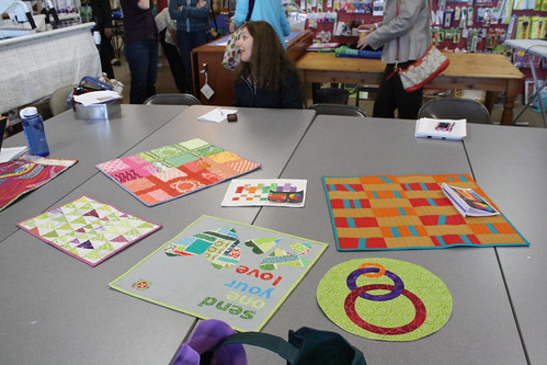
Photo by Laura Bennett, our photographer
Last week, Molli (hilariously) taught you how the color wheel works. I'm going to take you a step further on the wheel to show you how color can come together and work beautifully - even if you have doubts. I had a lot of fun putting together bundles for this post, so I hope you enjoy them just as much as I do! Anyone can make colors harmonize together :). Promise!
A note - Color Scheme Designer 3 is my go-to tool online for quilty color schemes. All the pictures are screenshotted (screenshot?) from this fabulous website. You can actually click the buttons to show you the combinations I'll demonstrate, and then whirl the color wheel around to your liking - how nifty is that? Okay, go play for a minute, then rejoin me here :)
Analogous Color Scheme
On the color wheel, this is when you choose three colors in a row. This is probably the most "harmonizing" of the bunch, since the colors are right next to each other. Here's one combination I love:

Now I'm definitely inspired! SO want to make a quilt with these.


Dark blue to blue to green - the right fabric is actually more turquoise than it looks (it doesn't have to be exact!). As you can see, analogous color schemes are easy to put together and really make your quilt beautiful.
A complement is when you choose two colors directly opposite of each other on the color wheel. Often, one of the colors may be off by one or two notches on the wheel, but it can still be considered complementary.

Purple and yellow - the colors with the most contrast. This combination
can really intensify a quilt, but it also looks good balanced out with
white. I also like balancing it out with orange, which is somewhat of a
split complement color scheme (see below).

A lot of people love the orange/tangerine and blue combination - also a complement. Red and green, the typical Christmas colors, are complements too - which is why they look so striking together!


P.S. In case you haven't noticed, I LOVE Lizzy House's Pearl Bracelet line! Ever since they came out in a gazillion colors, they work with everything! If I make a quilt without a piece of it, the whole thing feels empty. :( Anyway... moving on!
This is one of my favorite combinations, and the one I've been experimenting with the most! I never would have picked the scheme I did without playing around with the color wheel. This one is called "accented analogic" on Color Scheme Designer 3. Don't let the complex name scare you - it's awesome.

Here's my contribution to our May swap, Fruit Punch, which is inspired by the above color wheel.

I started with this bundle of fabric and worked from there! I was pleased to find that I had so many fabrics in my stash that fit. You can click here and here to read my posts about this mini quilt!

Split Complementary
As you can see on the color wheel, this is when you choose a main color and the two colors on either side of its complement. The split complement is not as harsh, if you will, as the direct complement described above, but it is very unique and will add variety to any quilt.


The possibilities really are endless. Try not to get bogged down in the names and technical aspects - it's all abut having fun and making those colors really "go together." Like I mentioned, the colours don't have to be exactly in order for them to harmonize! It just takes practice and a bit of patience (and some extra fabric shopping ;) ).
Links
Here are some links that will help you further with color harmony and combining:
- You can see my post on the CJMQG blog about our March Color Workshop.
- Haven't tried Design Seeds for inspiration? It's time. They post palettes every day, based on pictures. Plus, you can go to the "palette search" tab at the top to pick a specific color and see which premade schemes match with it. You can also search by themes!

June 12, 2013 post from Design Seeds - LOVE this soft, summery combination. Seriously, try this website out right now!
- At Color Palette Generator, you can add the URL of a picture from the 'net, and it will give you the color scheme. How cool (and useful) is that, especially with Pinterest at our fingertips?
- Also, at the Big Huge Labs Color Palette Generator, you can do the same, but for a picture from your own computer. I took a picture from my 2011 trip to Prague and tried it out:

I tried to do a more "colorful" picture and, unfortunately, it didn't pick up the bright colors too well. But you get the idea - this tool can really help and inspire!

- Check out Jeni's fantastic series on color and your fabric stash, The Art of Choosing.
- Color Theory 101 by James George - an informative article on Design Festival.
I hope this post was helpful, and that you'll enjoy putting colors together in new ways! Let me know if you have any questions!


No comments:
Post a Comment
Let's start a conversation! I love comments and I'd be happy to reply to all who have an email address accessible. Thanks for commenting!