
June 26 - October 4, 2016
Share your fabric choices and progress!
Instagram: #starlightstardarkqal


-------------------------------------------------------------
(By the way, the winner of the QAL bundle is Martina, who has been emailed! Congrats, Martina!)

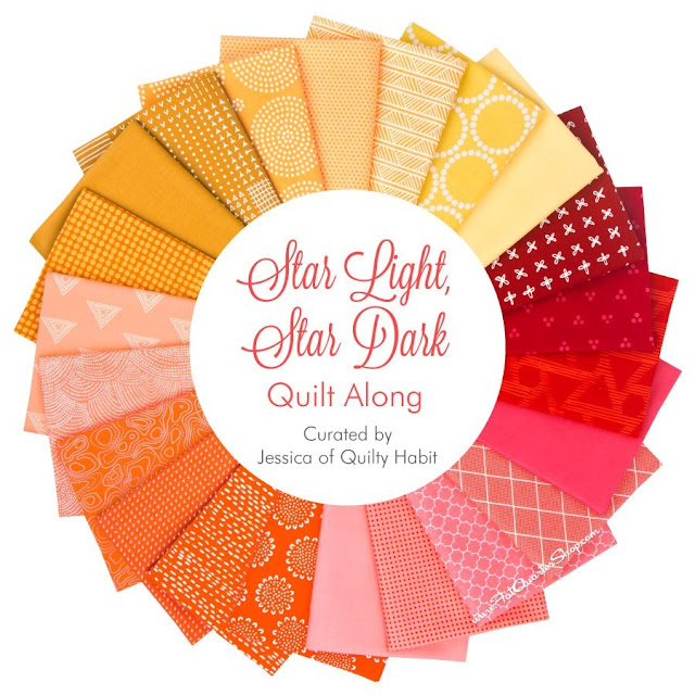
QAL Fabric Requirements
Lap size: 51" x 70"
6 blocks (above picture) - 3 colors
Top Color (sample - green): 7 light fat quarters, 6 dark fat quartersLap size: 51" x 70"
6 blocks (above picture) - 3 colors
Middle Color (sample - blue): 6 light fat quarters, 7 dark fat quarters
Bottom Color (sample - purple): 7 light fat quarters, 6 dark fat quarters*
Backing: 4.25 yards - includes overage for quilting
Binding: .75 yard
Baby Size: 51" x 46"
4 blocks - 2 colors
Top Color: 7 light fat quarters, 6 dark fat quartersBottom Color: 6 light fat quarters, 7 dark fat quarters
Backing: 3 yards - includes overage for quilting
Binding: .5 yard
*Please note: This is the MAXIMUM amount of fabric for an ultimate scrappy look, like my quilt above - you WILL have a lot extra. I used fat quarters here because they're more accessible and easier to buy/find than fat eighths. You could also use just fat eighths (typical size 9x21) for most of the requirements EXCEPT for 2 fat quarters in each dark and light for EACH color (for the large star and its background). Let me know if you have any questions!
------------------------------------------------------------------------------

-----------------------------------------------------
Important Factors To Consider When Choosing QAL Fabrics
Important Factors To Consider When Choosing QAL Fabrics
*Stick to fabrics that are solid, like-solid or tone on tone (one color featuring a different tone or shade of that same color), and small prints (large prints will detract from the stars you are trying to create). The bundle I curated for the Fat Quarter Shop (which you can buy here) illustrates these points.
*Stick to prints that have less white and more color. For example, the photo below shows two fabrics on the left with a little bit of white (good) - the four fabrics on the right have a lot of white (bad). Too much white washes out the quilt and takes away the focus on color. Stay away from black and gray as accents on colored fabric (they can muddy the quilt). I'm sure a quilt with a dark gray/light gray color scheme would be so lovely, though!

*Create contrast!! Read on!
-----------------------------------------------------------------------------------
All About Contrast
These are my thoughts based on years of working with various colored modern fabrics and making this quilt. Hopefully this post will help you think about how you will pair your fabrics together when we start cutting. Feel free to comment if you have any tips or questions!
Contrast is, at its simplest, when one color appears brighter than/sticks out against another. Now, pitting two very different colors against each other is easy enough. Think light pink against bright green (HUGE contrast , below). But what if you're making a quilt (like this one) where you are creating contrast WITHIN the same color? This is called gradation.


^1 of the 6 blocks for the quilt - light purple gradation
Let's look at the range of reds I'm using to make my second Star Light, Star Dark quilt. The top row will be my dark reds, and the bottom row will be my light reds (two separate blocks).

We'll examine the dark reds first. I decided to supplement my FQ bundle from Fat Quarter Shop with more fabrics from my stash. The top row contains deep reds, and the bottom is tomato reds.

When I combine them, they contrast! In the picture below, I am using the top fabric as the background for a large star, and the left bottom fabric for the star itself. The solid fabric on the right also provides a great contrast. When you have a busy white print like this background, a solid will always stand out against it, even if it's the exact same shade.

I also split apart my light reds below. This would be for the light red block in the quilt I showed above. On the left are salmony reds, and on the right are lighter, pinky reds. I will use this separation to choose my star backgrounds from one pile, and the stars from another, so they really pop. I could also use the solids with ANY of these fabrics to create great contrast, whether subtle or no.

Here's how I separated my yellows: mustard on top for one block (dark yellow) with bright, lemony yellow on the bottom for the second yellow block (light yellow). You'll notice there's a great range here in terms of saturation (color intensity); this will allow me to really contrast within the dark and light blocks.

This middle solid yellow below will be a perfect large star, and the left mustardy fabric with the white print behind it (from Blueberry Park by Karen Lewis) will be an awesome background (or vice versa). Similarly, the fabrics to the right are both light, lemony yellows, but they make a great contrast due to their differing values and print size/scale.


Watch when I add red orange in the middle and how much the range grows! I plan to incorporate these into my dark orange block. This color adds so much more contrast! Feel free to PLAY with fabrics and maybe even have a few backups before you decide to cut into them next month.

In sum:
1. Use solids for an easy contrast to prints. 2. Play with saturation (intensity) to achieve contrast between the backgrounds and stars.
3. Be ready to play with fabric to choose your final layout (more on this will be posted on July 18!). Have an open mind and go for it!
4. Organize your fabrics into color groups to help you choose what will work together.
Also:
5. Don't be afraid to use some darker or lighter fabrics in the opposite block to create contrast. 6. Just a little bit of contrast can make a huge impact (as in, the stars don't have to be on a HUGELY contrasting background).
As you are choosing your fabrics, please feel free to share and/or ask for help on the Facebook group, or post your selections to Instagram under #starlightstardarkqal and tag @quiltyhabit - I'd love to see! Your question could be one that someone else has, and sharing fabric selection is always a great way to interact with the many other quilters who are making the quilt! :) You can also email me here if you want a second opinion - I'm always happy to help.
Now you have a couple of weeks to gather your fabrics, and then a couple of weeks to cut your fabric before we start piecing the blocks in August. I can't wait to see what you make!

I've since finished quilting my first QAL quilt - I'll share more soon! Here's an in-progress photo.
QAL Schedule:
June
26: Fabric Requirements
and All About Color Contrast <<you are here!
July
11: Show Us Your
Fabrics Linkup (open through August 1)
July
18: Planning Your
Layout and Cutting Instructions
August
1: Piecing the Large
Stars
August
8: Piecing the Small
Stars
August
15: Share Your Progress
Linkup (open through September 1)
August
22: What Is Alternate
Gridwork?
August
29: Piecing the Top
Together
September
12: Quilting
Suggestions
September
19 - October 3: Final
Linky Party - Link up your Finished Quilt - Prizes Up for Grabs!
October
4: Winners announced

How exciting, Jess! I am going to go pick out some fabric now!!! :)
ReplyDeleteSo fun! I like this design and the challenge of pulling from my stash to make this work.
ReplyDeleteThank you Elizabeth!! I can't wait to see what you pull! I don't have your email so I'm replying here - hopefully you see it.
DeleteI did see it! Thanks Jess!
DeleteI'm loving watch this all come together! All those fabrics are eye candy!
ReplyDeleteOh thank you so much for all your input into choosing the fabrics. This is very helpful and even more exciting! And my heart still jumps when thinking about being the winner of your lovely bundle. Oh so amazing and wonderful!
ReplyDeleteIt's so hard to decide on colors! Thanks for giving some possible combinations! And I really like the start of your quilting.
ReplyDeleteI'm gonna poke around in my stash and see if I can come up with a fabric pull... my colors might be dictated by what I have the most light tones of.
ReplyDeleteVery helpful discussion on color selection. I am looking forward to picking out my fabrics.
ReplyDeleteLooks like a fun one;) could you please add me [email protected] thanks!!
ReplyDelete